
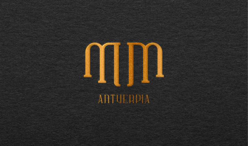
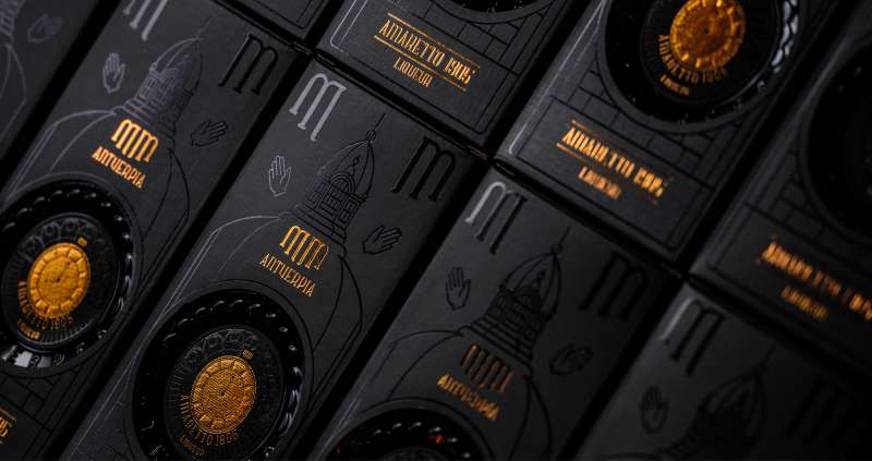
MM Antverpia
Wat als je de grootsheid van Antwerpen kon vatten in een fles? Met een statige branding en iconische fles en verpakking hielpen we MM Antverpia een monumentale entree te maken op de drankenmarkt.
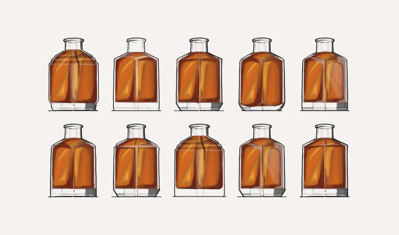
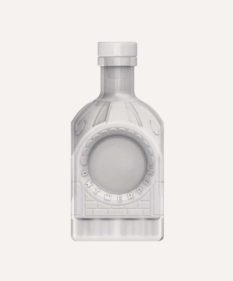
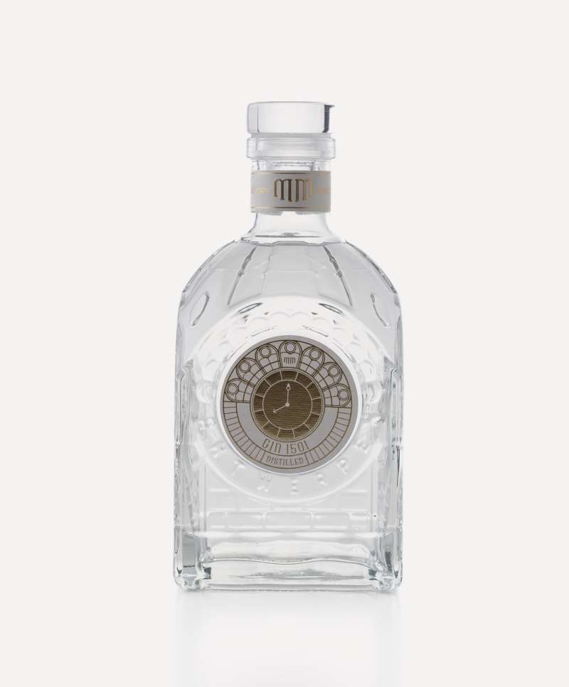
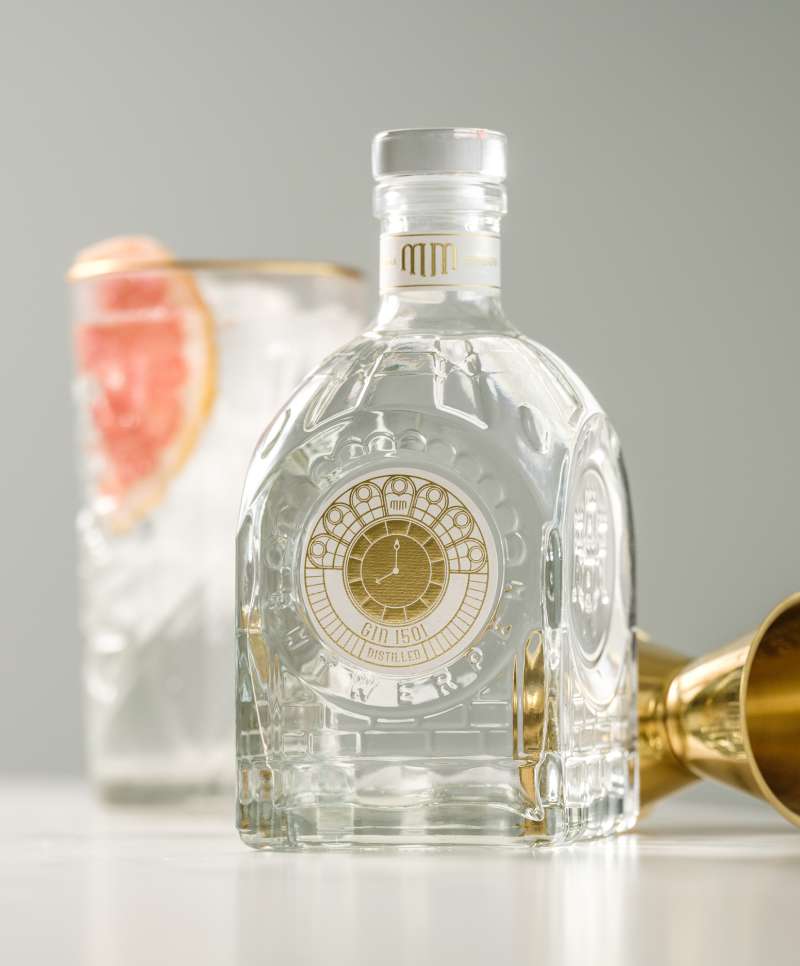
A monumental bottle for a monumental drink
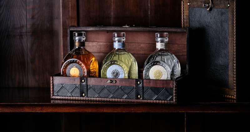
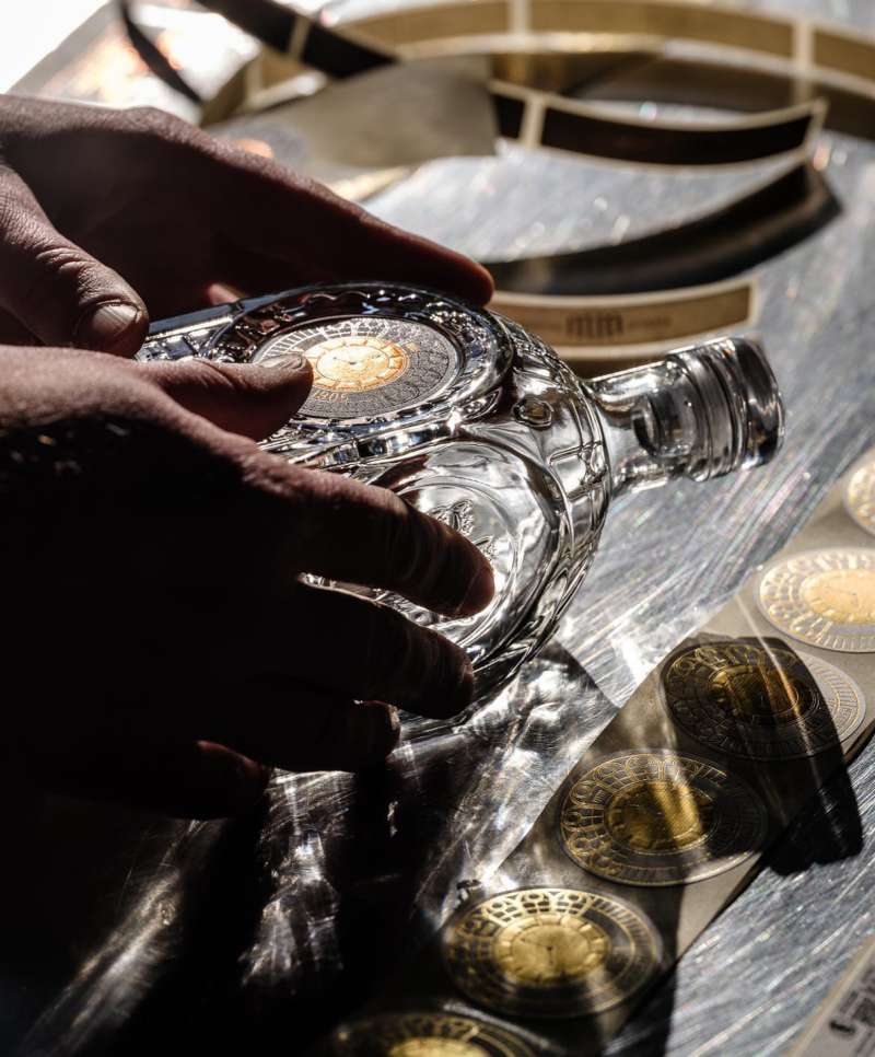
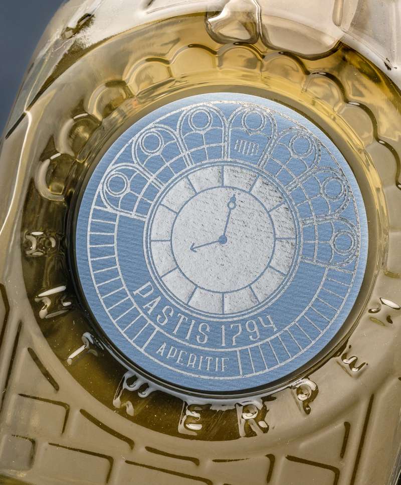
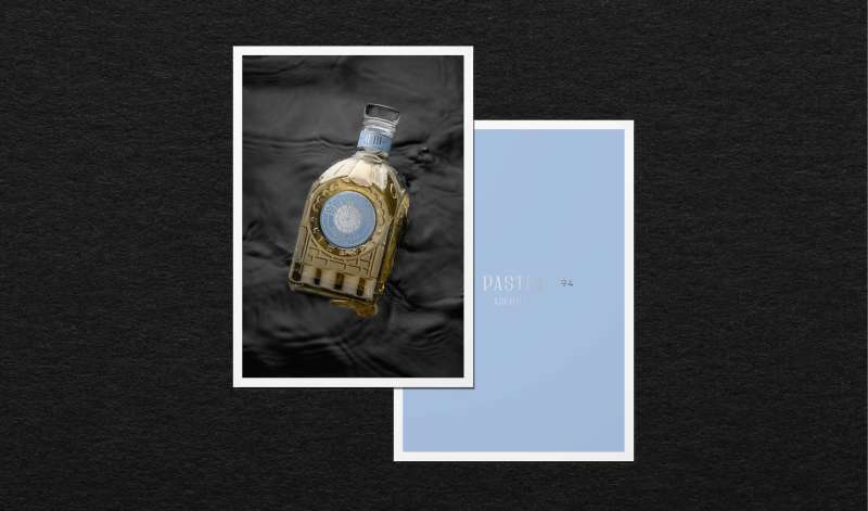
MM’s bottle’s design features the monumental details of the Central Station, rising above the water of ‘t Scheldt, and Antwerp’s traditional royal crest. The centerpiece of the bottle is the station clock, which we translated into the bottle’s label. The colors of each label were carefully chosen to evoke the distinct flavor profiles of each distillate.
Balancing tradition and innovation
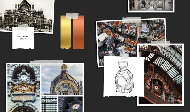
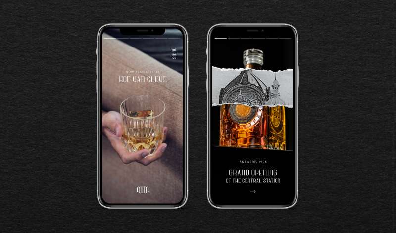
MM’s visual identity delicately balances contemporary and classic elements, from typography to photography. The outcome is a group of consistent, high-end touchpoints that evoke the city’s rich history and celebrates its modern spirit.

Credits
Videography — Joffrey Vandenbussche
Photography — Pieter D'Hoop
Inspired by this case? Curious how we can make your growth count? We're happy to share our thoughts and discuss your challenges.
Contacteer ons
We komen zo snel mogelijk bij je terug