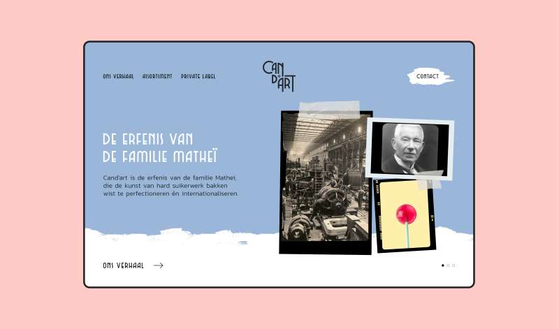
Cand'art
Ongelovigen zeggen dat het niet de moeite waard is om een B2B-merk aantrekkelijk te maken, maar daar zijn wij het niet mee eens. We creëerden een smakelijk merk dat de geschiedenis van Cand'art benadrukt en de weg bereidt voor toekomstig succes.
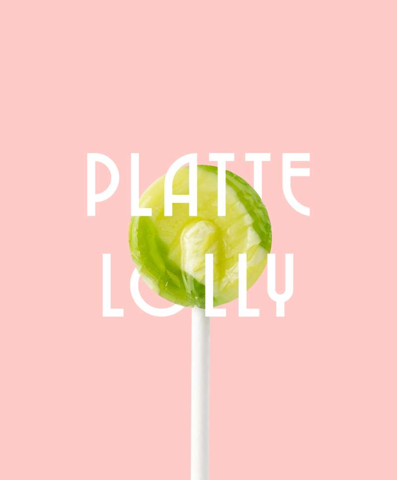
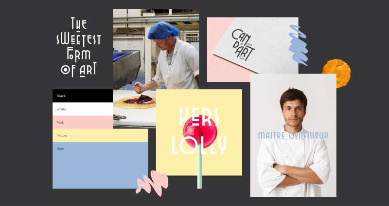
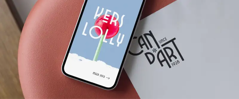
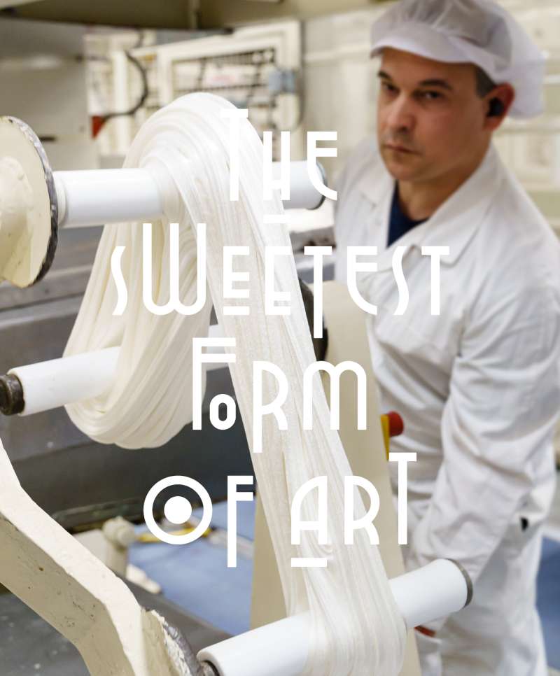
The sweetest form of art
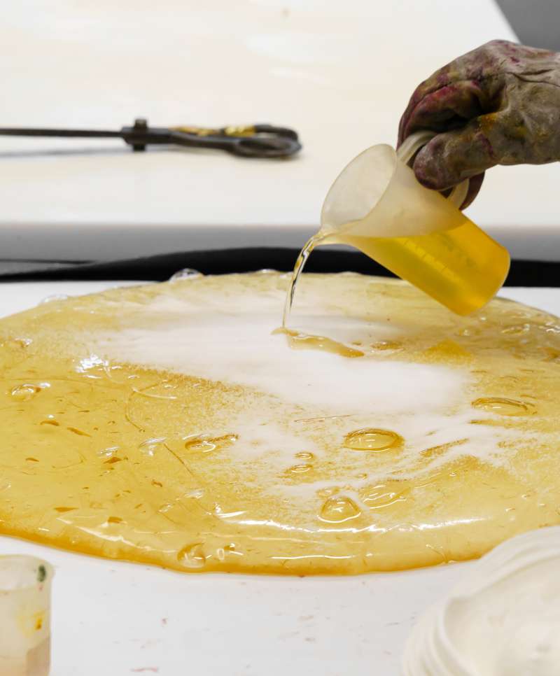
Cand’art is an established value for candy connoisseurs. Like a true artist, their in-house maître confisseur knows exactly how to add the right amount of flavorings and colors, bringing the absolute perfect lollipop to life. “The sweetest form of art”, Cand’art’s new tagline became an inspiration for the whole branding.

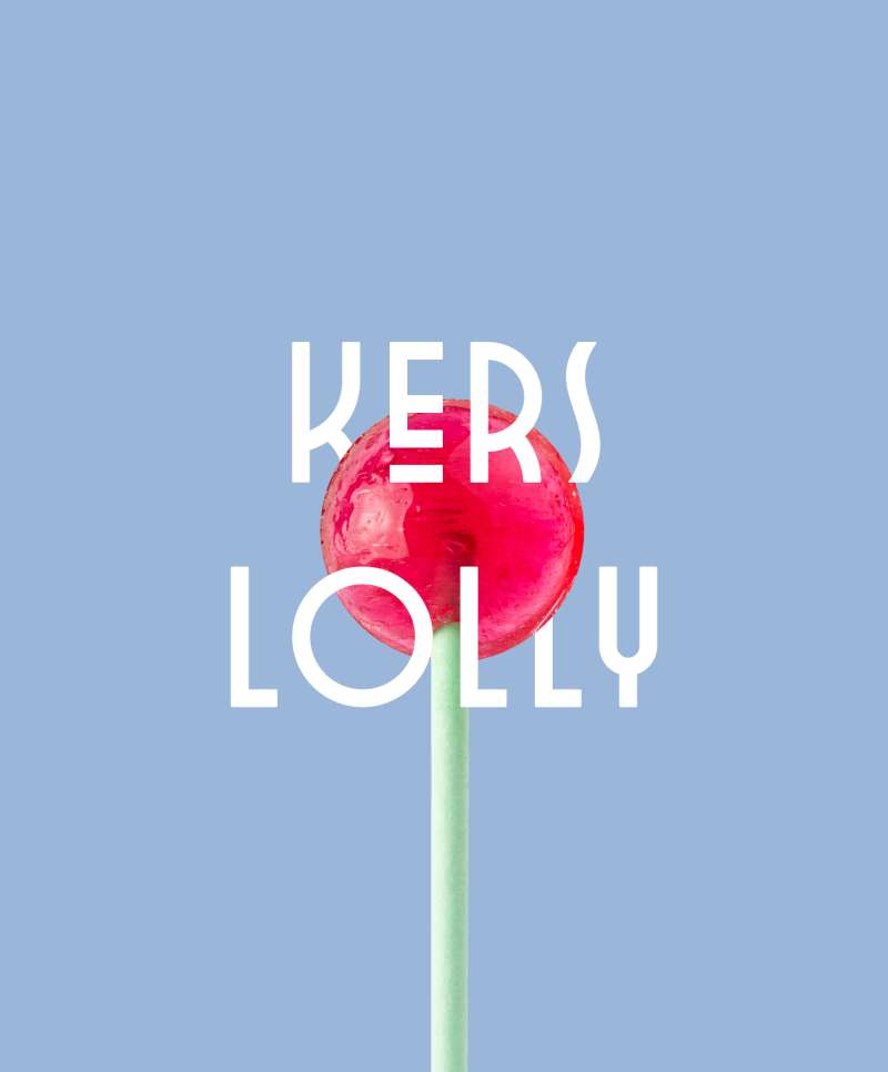
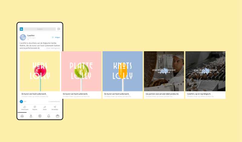
A fingerlicking typography system
Cand’arts rebranding features a dynamic typography system, that is flexible and playful, capturing the essence of the brand. The typography’s adaptability speaks to Cand’arts ability to shift fast, according to their clients’ needs. And it looks delicious too.

Herman Wellens, CEO of Candart
"Through strategy, rebranding, a new logo and a new website, Equals Three helped us make our beautiful products attractive to current generations. The result elicited rave reviews from our international customers."
Inspired by this case? Curious how we can make your growth count? We're happy to share our thoughts and discuss your challenges.
Contacteer ons
We komen zo snel mogelijk bij je terug