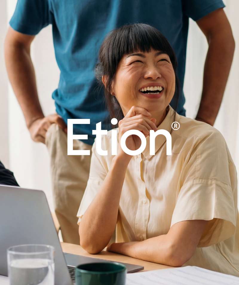
Etion
Etion is more than a member organization; it is a vibrant community of entrepreneurs and leaders. Although the organization has a 100-year legacy and a loyal following, its ambitions and DNA were no longer reflected in the way the brand came to life. A total rebranding provided Etion with the proposition and identity it deserved: a brand that inspires, invites, and enriches the community with new and younger members, without compromising its depth and vision.
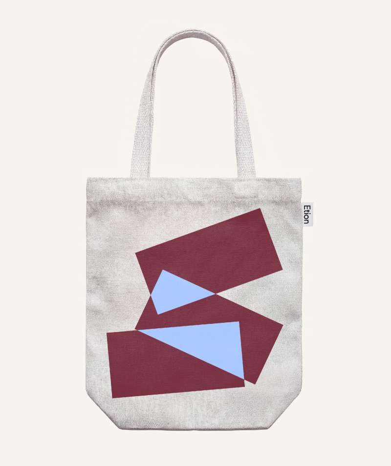
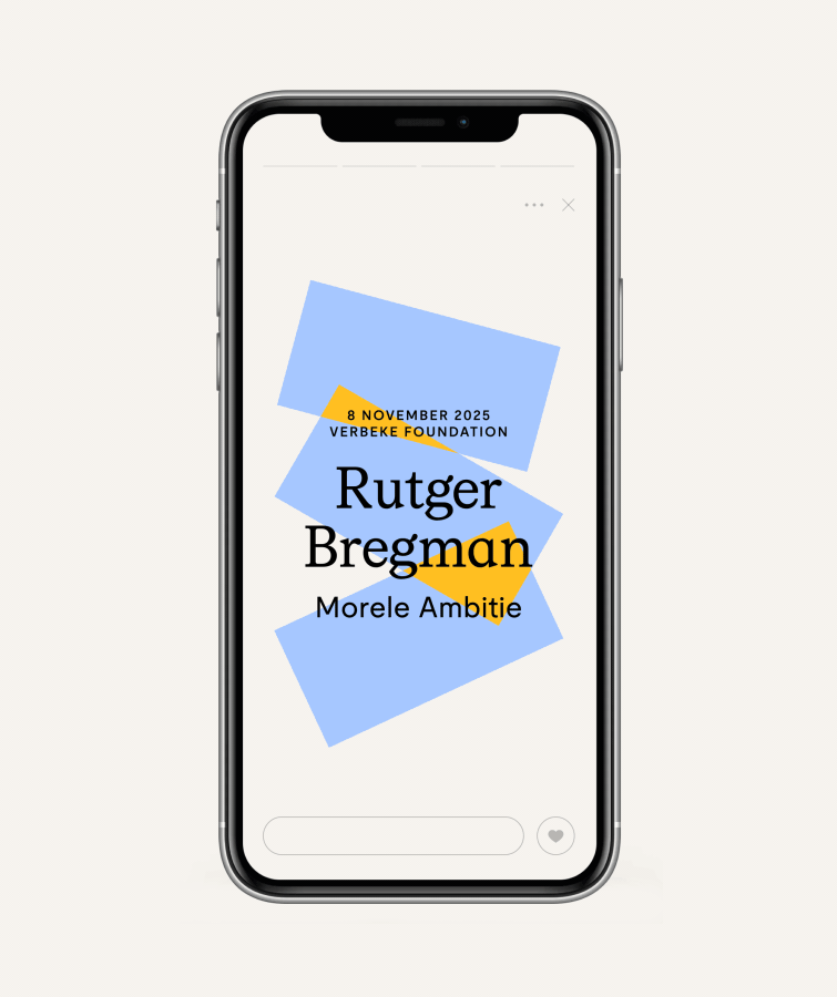
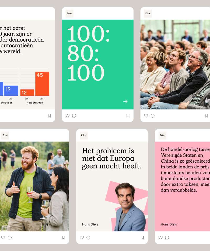
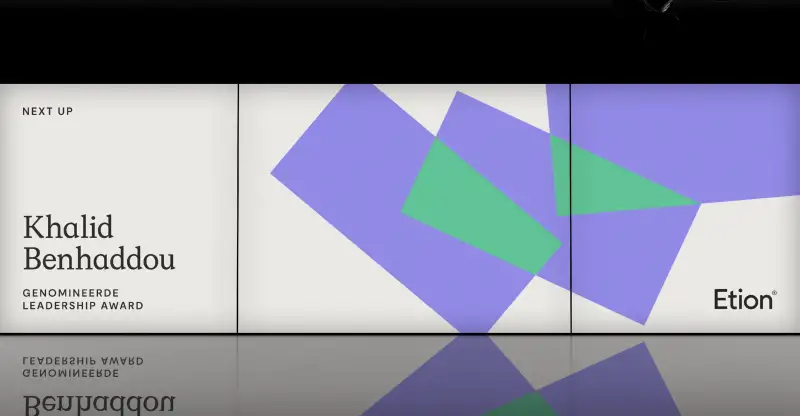
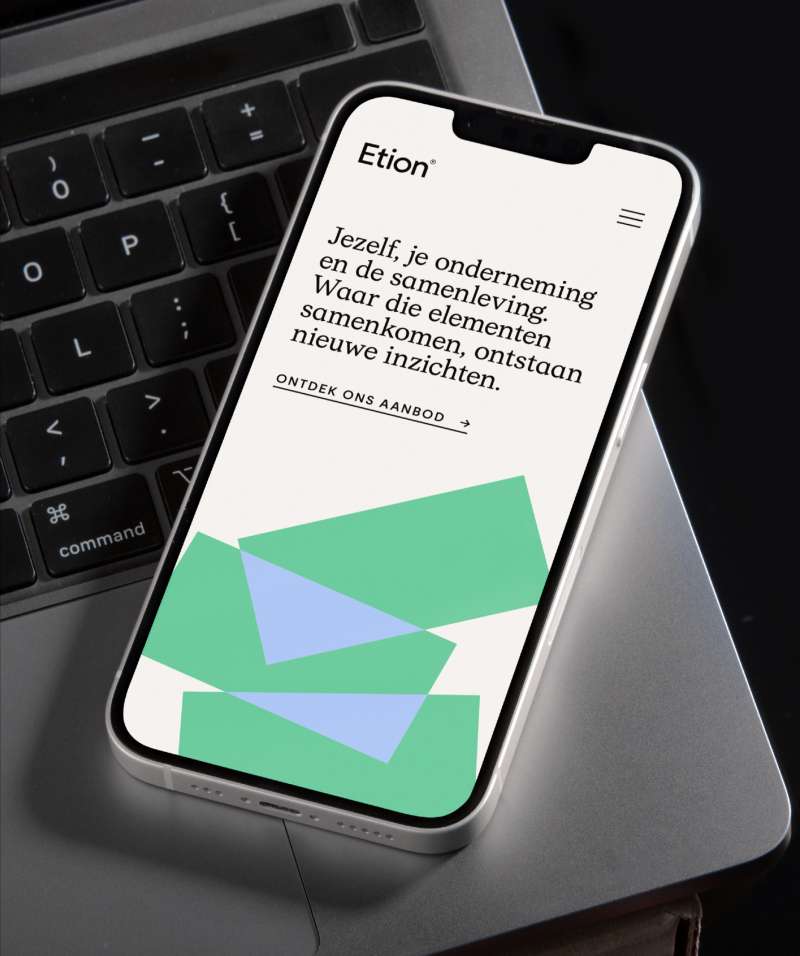
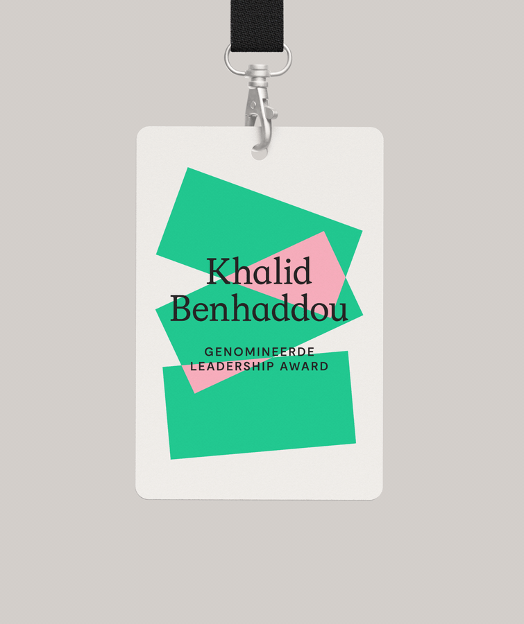
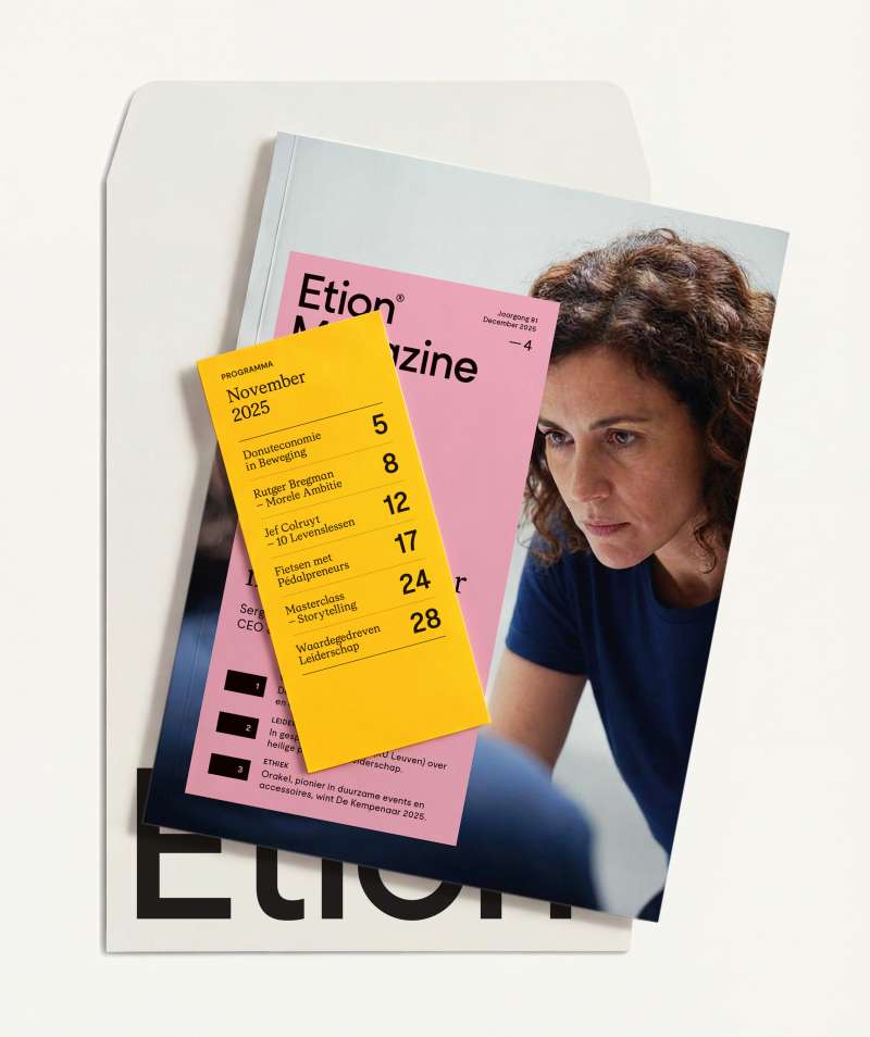
A solid visual foundation
The three pillars of Etion — society, the organization, and yourself — form the foundation of the new identity. When these converge, they create new perspectives and colors. The result is an infinitely scalable graphic system that embodies Etion’s culture: warm, inspired, proud, and a touch playful.

Wim Dubois,
Creative Director Etion
"Equals Three provided natural direction, translating our authenticity into a powerful foundation for future growth. This collaborative process resulted in a bold identity that inspires the next generation of leaders and unites our three pillars — yourself, your company, and society — into an energetic movement."